Article Updated: 11 Jan 2019
With the official launch of Android Oreo in August 2017, it was expected that Google will make another major face-lift for the Play Store app
GOOGLE ANDROID PLAY STORE APP 2018 UPDATE
I have already wrote a small article about Google Play Store update in August 2014, and another smaller update few months later of the same year.
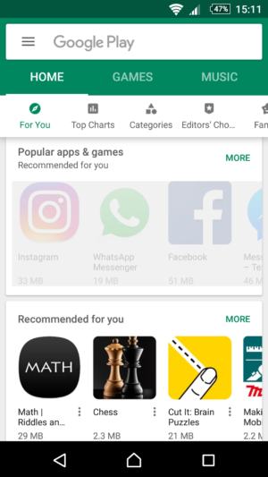
Regarding material design and white-green theme, new badges, buttons and other appearance gimmicks, there was virtually no change until now! Google mildly changed the pale green color to the more contrasting, stronger green accent, perfected transition animation effects, placed few shortcuts in the sidebar menu (e.g. Google Games and Music services, Subscriptions, Security section called Play Protect etc.), but the overall design & feel was more-or-less practically the same as the 2014 update.
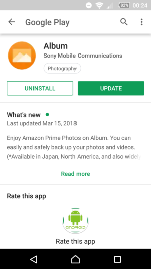
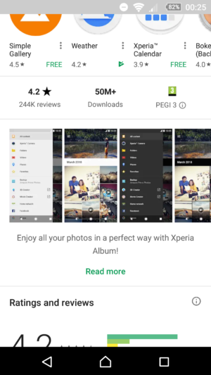
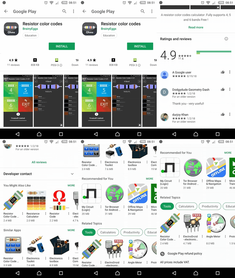
Welcome to 2018 Play app edition. While some elements like green/white buttons are still here, overall the product page is almost completely white. It kinda returned to it’s roots with a twist. Badges are still here, however, they are less visible and pronounced without circles, and we kind of miss them :)
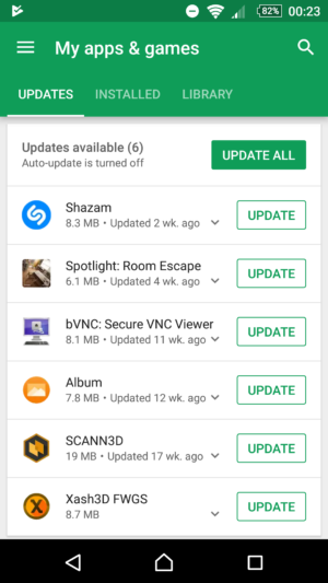
Another important update “thing” are the changelogs / what’s new drop-down sections under My apps & games > UPDATES menu. Cool!
Overall, it’s a great design overhaul, it will just take some time to adjust to the design changes, particularly if you are a type of person who doesn’t like any changes whatsoever at all :)
Google pushed few minor layout redesign iterations of the app’s product page: adding app total download size (finally!), integrating app promo video with the rest of the gallery (logical!) and shuffling reviews and product sections positions (we don’t particularly like this change, but we’ll get used to it).
One particularly annoying thing (which lasts for at least a year or two) is the fact that Not interested option doesn’t seem to be working at all! Once you set apps you don’t particularly care about, they’ll temporarily grey-out and next time you restart Play Store app, they’ll reappear as if nothing happened! Notified Google about this issue, but they still haven’t figure it out.
Instead of conclusion, here’s a small gif animation of updated Play app product page:






![Xiaomi App - How To Re-Install Stock Factory Version - How To Fix Corrupted Gallery App [no root]](https://tehnoblog.org/wp-content/uploads/2025/09/Xiaomi-Gallery-App-Code-Bugs-Artwork-1024x576.png)






Comments
Post A Comment