This week Google put a ‘material design’ face-lift on it’s Play Store website for mobile devices.
What does the new change bring and could it have been done better?
INTRO
Half a year ago I finally jumped onto Android train and found myself in a new world full of wonders. Play Store really has astronomical amount of apps and information, you cannot possibly discover in an average human lifetime.

Google Android Logo
And after some learning curve, Google already made a new change to the Play Store. A long expected one, mind you. There was nothing wrong with the old layout in my honest opinion, but the new layout is almost completely vertical-scrolling experience.
 @ Sony XPERIA")
Google Android Play Store Market update (August 2014) @ Sony XPERIA
BEHOLD
Central part of the new Play Store market is, of course, a video section. It plays two substantial roles: first as an App Wallpaper, and second one, as a YouTube embedded video. Nice Touch! ;)

Google Android Play Store Market – Wallpaper / Video title
Another gimmick, so to say, is that search bar now acts as a floating web element (which I am not particularly fond of), that automatically blends with video at the top, and gradually appears and fixes as you scroll down the page, so you can easily navigate (say, search for another app if you change your mind).

Google Android Play Store Market – Title section
One feature that is a little bit annoying is the fact that now you have to click on ‘READ MORE‘ buttons to read more info about the app, size, permissions etc. Same holds true for the first 3 USER COMMENTS, which are now aggregated (shortened to first hundred characters or so). Definitely a slowing point of UI.
BADGES
Completely new feature from Google Play Store are new badges, which have a sole purpose to quickly inform users about the app at a glance.
First badge informs the user about rounded total downloads (in thousands, millions etc.). Second badge, of course, shows average app/game rating and total share votes. Third badge represents the App/Game genre, which is a completely new feature from Google. A nice one! Finally, there is a similar apps badge, which acts really as a shortcut. Now, that last badge could be better replaced with the app/game’s rounded size (in kB, MB, GB…), instead.
In order to see what is the size of the installed app, user must expand the READ MORE section and scroll all the way down, where other info’s like Author and such are present.
Google Android Play Store Market – New Badges
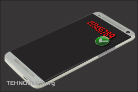
Another issue is the fact that I don’t particularly fancy new download count badges much. Instead of cramped words ‘thousand’ and ‘million’ – simpler short designations like ‘k’ or ‘M’ could be much more effective. See my quick mock-up below:
Google Play Store Market – Alternative Download Count Icons
CONCLUSION
In the end, the update is a nice one, in general, but could be further improved with small changes described above – which I’d very much like to see. After a while, I guess I’ll completely forget about the old market layout and simply adapt to the new scheme.
After all, do we have an actual choice not to ? :) Even if you uninstall Android Market app update from your device, the very next time you connect to the network, it will be auto-updated regardless of your auto-updating preferences.
’till next update…


![Xiaomi App - How To Re-Install Stock Factory Version - How To Fix Corrupted Gallery App [no root]](https://tehnoblog.org/wp-content/uploads/2025/09/Xiaomi-Gallery-App-Code-Bugs-Artwork-1024x576.png)