

Given all-white craze launched with Android Pie release back in August 2018, Google, as already expected, pushed yet another redesign of their Market app
Google Android Play Store Market Update (August 2019)
Google Play Store
Last year Google was in the white-grey-green mood design update, and in the past 10 days that green and grey colors were ditched for almost completely all-white design with a pinch of colored text.
Everything is a lot cleaner and simpler now, but the white dominance is not the only consequence of this. If you take a careful look between this and last year’s design, you will notice that certain elements have moved around, and others are completely gone!

Google Android Play Store App August 2019 Update – Home Page
For one, HOME / GAMES / MUSIC green bar at the top is now gone; it is replaced with the bottom bar containing GAMES / APPS text and icons, but also Movies & TV and Books (depending on your location and service availability). Music App is now only linked from the sidebar menu with the launch action or prompt to install Google Music app. Premium games is now on 3rd position, Categories are 4th, and Editor’s Choice was moved to the last item in a horizontal bar row. Icons, search input box, buttons and other rectangle elements are now more rounded to match overall Google design trademark.
Another thing that we’ve noticed by looking at the HOME PAGE is that the icons in the (still present) top bar For you / Top charts / Premium / Categories / … are gone. Titles are now text-only versions, more streamlined, with a bit smaller (vertically condensed) font, consuming less screen real estate.
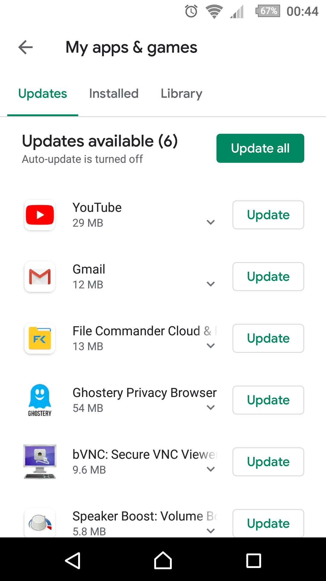
Google Android Play Store App August 2019 Update – My Apps & Updates
My Apps & Updates section was on a diet regiment and became slick, too. While there are no longer horizontal lines separating each row, there is also no longer information about when the app was updated last time. Update size is still available, though. For how long? We can’t say, as we don’t know.
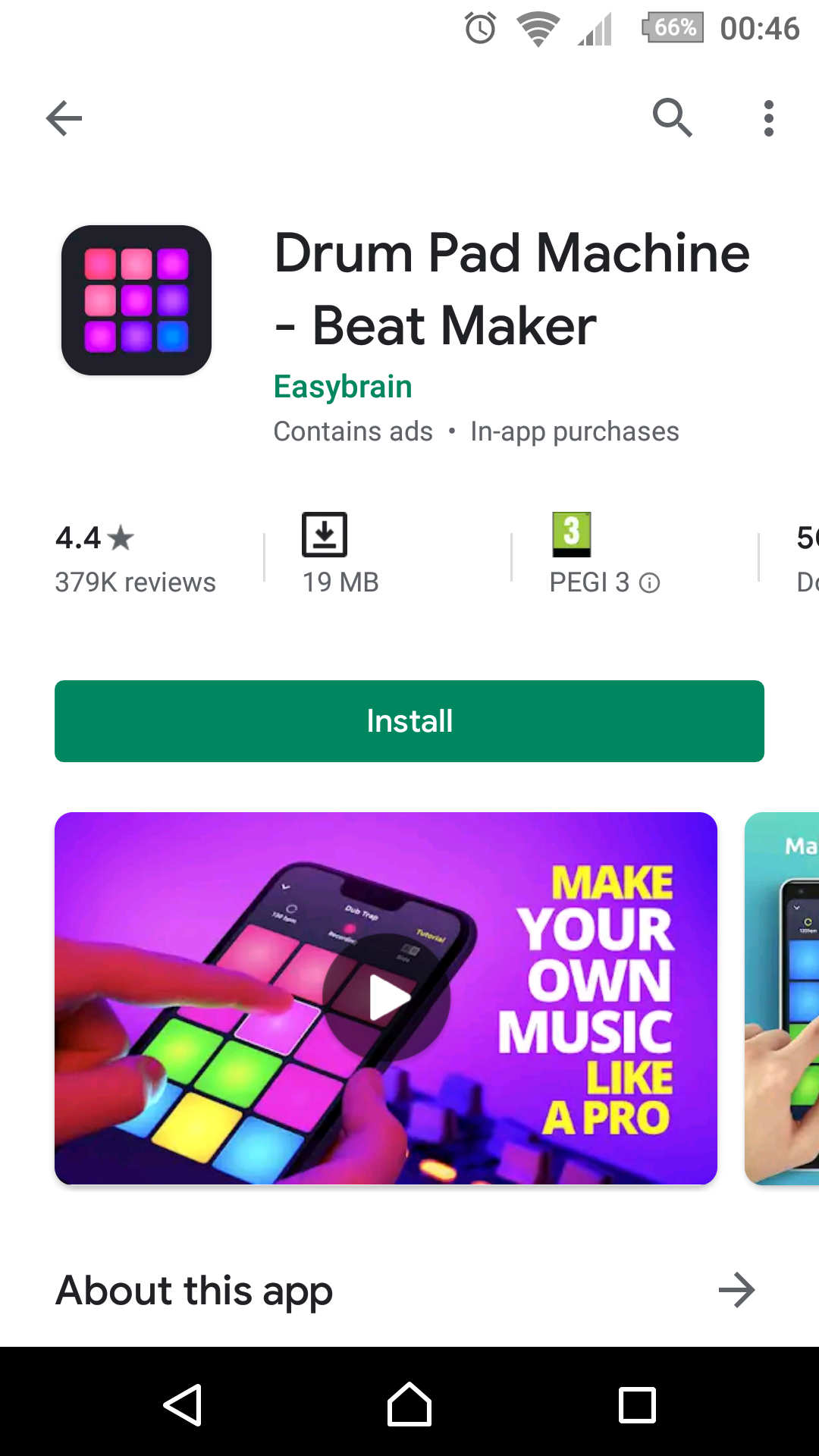
Google Android Play Store App August 2019 Update – App Page 1
Next, there are no longer 3-dots drawer icons next to each app’s thumbnail image and title. You can no longer tell Google that you are not interested from the Suggested for you slider. Finally, Google drifted away from original Material Design 1.0 (now unofficially dubbed Material Design 2.0), where sections were grouped by white boxes with “3D” outlines/shadows placed on a pale grey background. Now, everything is completely white, and sections no longer have clear boundaries where they actually belong. This also affects ads (or promoted apps) section.
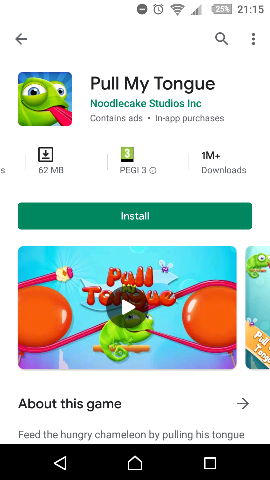
Google Android Play Store App August 2019 Update – App Page 2
As you can see, we are witnessing a lot of simplifications, less options and, for some reason, hiding some information from the users.
What do you think of this update?
Do you like it?
* * *
One thing that isn’t strictly related to the design, or this particular iteration of the Play Store app itself: the App’s reviews section. In the past year, Google added options to filter reviews by more useful parameters e.g.: positive, critical, specific number of stars rating, mentioned keywords and so on. Except, we doubt about that ‘Most relevant‘ algorithm honesty a bit, it is probably skewed a little to promote positive reviews at the top. Still, it’s good.
Also, when user leaves a review, it can now easily edit it, and see a complete review in a box (on some devices we had serious editing issues with keyboard and input text box jumping around the screen unnaturally in unexpected fashion). Also, reviews now show you 500 character limit and counter when you are close to the limit.
Kudos for that!


![Xiaomi App - How To Re-Install Stock Factory Version - How To Fix Corrupted Gallery App [no root]](https://tehnoblog.org/wp-content/uploads/2025/09/Xiaomi-Gallery-App-Code-Bugs-Artwork-1024x576.png)


Comments
Post A Comment