Google is currently undergoing corporate structural change, with Alphabet and all, however, one unexpected thing happened on September, 1st.
NEW GOOGLE LOGO!
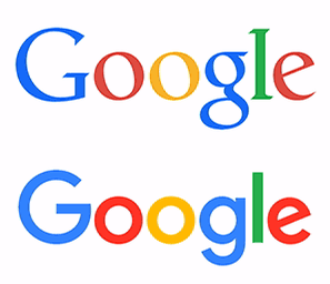
Google Logo (September 1st 2015)
New vs Old Logo Animation
How we made this?
Yup, fresh & brand new one. One could say this was a bit expected, given the big news few weeks ago, however, I was personally left surprised. I mean, Google is such a strong brand in the world, recognizable almost on every inch of the planet, and yet, change can be good or bad sometimes.
However, this is not the first, and definitively not the last metamorphosis of the Mountain View, California giant. Google is known in the past to change design layout, functionality of it’s search engine landing pages, mostly for the better usability and improved functionality. You can say that Google is constantly changing, driving everyone else along the ride.
SERIF vs SANS-SERIF Font Typeface
New font used is radically different from the old one – serif font has been replaced with a web-optimized / web-friendly sans-serif typeface. I have to admit, this feels good, however it will take some time for adjustments.
Also, the colors are much more vivid & saturated, with sans-serif font glyph more fat. It surely has that “punch” effect, whereas the old one was more traditional with counter-clockwise rotated o and e letters kind.
Now, I have to wonder will g+ logo be updated, as well, since it’s letter g is based on the old font? Time will tell this story once it’s ready.
update: yes, G+ logo has been changed as well. New capital letter G with + sign appended to it.
NEW FAVICON! YEAY!
With new font / logo design, comes new favicon icon, right? Right. New favicon is a simple first letter G, just as the old one was, however, new change is more life-like and vivid, consisted of a mixture of 4 Google trademark colors. And, here I have a tiny little problem. I preffered the old one, because of 2 things:
- Icon legibility was higher, simply because it was consisted of a single color
- The round circle-shaped white background kind of sucks (there, I’ve said it!)
There is no doubt that new favicon looks awesome on a larger scale, but on a tiny bookmark kind of thing it is, of course, a bit questionable IMHO. You may even say that it sucks. What we mean by this is that if white background was to be removed, the favicon might look somewhat better in browsers where tabs have a white color. But, on some other browsers (like Chrome) blueish tab color certainly does not make it easier. Now, it just reminds us of some funny colorful little worm bended in a shape of letter G. Old Google favicon was awesome!
Additionally, somewhat unnoticed, Google also changed the microphone icon, which is also colored now.






![Xiaomi App - How To Re-Install Stock Factory Version - How To Fix Corrupted Gallery App [no root]](https://tehnoblog.org/wp-content/uploads/2025/09/Xiaomi-Gallery-App-Code-Bugs-Artwork-1024x576.png)






Comments
Post A Comment