

GOOGLE INTRODUCES MOBILE-FRIENDLY RESPONSIVE DESIGN AS A RANKING SIGNAL
On April 21st 2015. Google decided to roll-out another ranking signal in it’s search ranking algorithm — check here complete Google Search Algorithm Timeline
Mobile usability was a hot topic in website design area for couple of years now. Various approaches and solutions exists to cover web for emerging mobile technologies and a widespread use of mobile devices (smartphones, tablets, phone + tablets = “phablets” etc.) Today laptop computers are almost considered as “desktop” machines and belong to semi-mobile platforms.
Google Logo
WHAT DOES THIS UPDATE MEANS?
In one line: Mobile-Friendly websites get a ranking boost in Google search results! This means that if a user searches for something on his/hers phone, the top results will be from the websites that have a content adjusted to the smaller screen sizes of the device itself. For example, Website A (from Company A) is much more popular and older than Website B (from Company B) and normally, it will pop-up at the very top in search for a given query. However, Company A has not invested in it’s website redesign and server old non-responsive pages to our visitor, who then needs to zoom and pan/scroll for the information it was looking for.
On the other hand, Company B has a modern website design built with latest technologies and that fact alone will give it the edge over the competition. And, finally, instead of showing up below or later pages, it will be shown at the very top, ahead the much popular and older Website A.
However, it is important to note that this update will not affect your website position (ranking) and visitors that come from desktop/laptop computers, and possible large tablets with high resolution:
This update:
- Affects only search rankings on mobile devices
- Affects search results in all languages globally
- Applies to individual pages, not entire websites
Good news is that this is a selective update. If, for any reason, you keep some pages non-responsive (either due personal or technical reasons), your website will not be affected globally.
HANDS-ON EXAMPLE IN PRACTICE
I run a small website for a client which is solid in design, simple couple of pages presentation, but it is not built with responsive / adaptive design in mind. And, thanks to Google’s courtesy, as a webmaster I have received a following warning:
Fix mobile usability issues found on http:// example.com
To: webmaster of website example.comGoogle systems have tested 6 pages from your site and found that 100% of them have critical mobile usability errors. The errors on these 6 pages severely affect how mobile users are able to experience your website. These pages will not be seen as mobile-friendly by Google Search, and will therefore be displayed and ranked appropriately for smartphone users.
The rest of the message can be read on the screenshot:
Google Page Rank – Mobile Friendly Error Report – SEO (click to enlarge)
The website in question was several years old (since 2012) and was enjoying a decent popularity and ranking in its field. However, after the mobile-friendly update a decline in mobile traffic was noticed and — when I ‘ve performed some common search queries it slipped from page 1 results #1 spot to page 2 #17 place in matter of weeks!
This event has set our alarm bells and required an immediate action: convert the website to responsive design. Frankly, I was not in a hurry simply because didn’t believe that this update was going to affect things so fast. Apparently it did.
POSSIBLE SOLUTIONS
For most websites the only real solution is to completely re-design your entire CSS and some portions of HTML code if necessary. Of course, for CMS themes you need to move some other stuff around, like PHP code as well.
However, for simpler non-CMS mostly static websites — a temporary quick solution would be to set-up a redirect that will catch mobile devices and point them to simpler, mobile-friendly versions. 301 redirects are followed by Google (they pass PageRank value) and will receive at least some traffic.
In fact, this was indeed a first thing that we’ve done for the above simple website and just after few days it got listed on the top of the search results! (other pages were ignored, and listed on later pages). The downside of this solution is obviously the 301 redirect. I had to develop special PHP code and cookies, to avoid constant redirect loop of our visitors once they click on “show full version” button in mobile version of the site. That was a small complication that was easily solved, but ultimately far from simplicity and clean solution. Not to mention the fact that most users do not like crippled mobile-friendly versions anyway.
After few weeks, when finally finished the responsive design conversion, and Google’s search took some time to pick new website up, the balance was again restored.
DEVELOPER TOOLS THAT WILL HELP YOU GET YOUR SITE RESPONSIVE
There are 2 website testing tools offered from Google that will be of a great assistance during responsive design conversion process:
#1 Google Mobile Friendly Test Tool
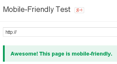
Google Mobile Friendly Test Tool
This is a streamlined tool that will help you specifically with responsive issues and guidance for solutions. A useful link that goes with it is Google Mobile SEO Webmasters Guide.
#2 Google PageSpeed Insights Tool
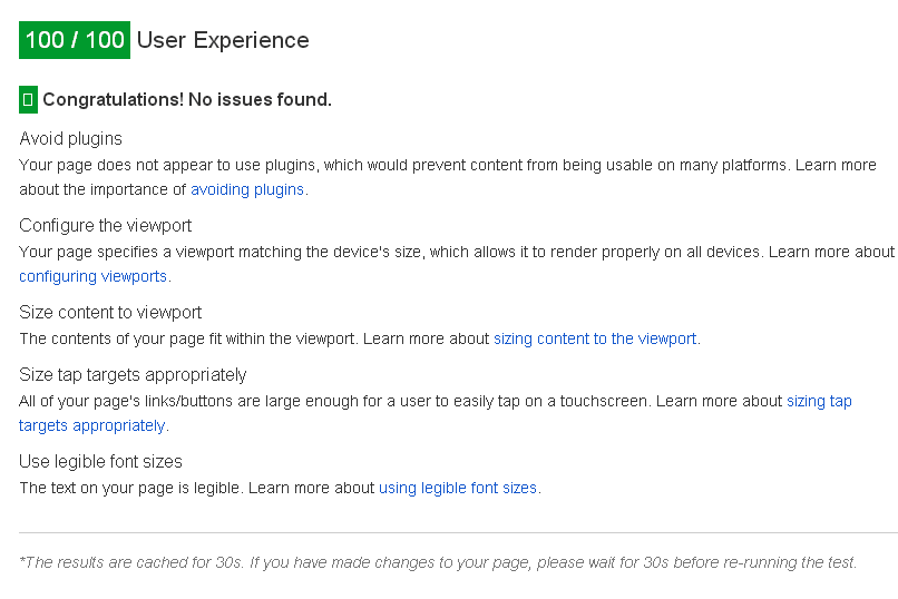
Google PageSpeed Insights Mobile Friendly Test Tool
As you can see above, our website in question passed with an incredible 100/100 responsive mobile friendly score above! Of course, this is possible only for the simplest websites. For more complex ones that rely on 3rd party widgets, plugins etc. that is a much greater challenge, because some external parts you cannot control.
One very important benefit of PageSpeed is the fact that it will actually show you the exact HTML elements that fall outside viewport (actual device’s screen) that you can fix straight forward.
#3 Google Chrome Browser – Developer Console
There is one more tool that I very much like – latest Developer Console inside Google Chrome browsers (from version 40+ above). What is so special about it in comparison to similar consoles from Firefox (built-in or Firebug extension), Internet Explorer / Spartan, Maxthon etc. ?
Well, for one, Chromium and Google teams advanced it way more than it is currently in other browsers. For example, auto-complete of CSS rules is more intelligent, almost as if it reads your mind. Jokes aside, I think that they have done some homework with statistical analysis of most frequently used CSS rules and configured their auto-complete feature to respond that way.
But, that is just one side of the story why I like Chrome’s Developer Console more. The another part is built-in mobile device emulator (smartphones and tablets) which can be activated by clicking the appropriate icon in the upper right corner:
Hit F12 to start dev console + mobile icon

Google Chrome Developer Console Mobile Device Emulator
The above 3 tools are invaluable and irreplaceable resources to get your website on the right mobile-friendly path!
CONCLUSION
Unlike with older updates in Google PR algorithm, this one was the first one that I actually noticed it’s effect almost immediately after the initial deployment. My advice is that you don’t wait any longer and jump into the wagon of responsive design. After all, Google does not send it’s warning emails twice. :)


![Xiaomi App - How To Re-Install Stock Factory Version - How To Fix Corrupted Gallery App [no root]](https://tehnoblog.org/wp-content/uploads/2025/09/Xiaomi-Gallery-App-Code-Bugs-Artwork-1024x576.png)


2 Comments
Add Your CommentI have seen many web sites did not pass the mobile usability test but still rank #1. Why?
August 19th, 2015Hi, it depends on the used search keywords – if the user specifically search for some particular website or term that is unique to that site, Google will put it on top, but without “mobile friendly” description tag.
August 19th, 2015