Given the final preparation for Android Lollipop release in November 2014, Google is giving another small facelift to Play Store
UPDATE
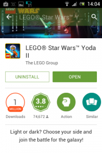
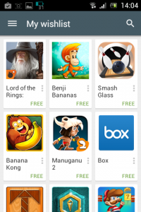
I have already wrote a small article about recent Google PlayStore update in August, and today we could see another minor facelift. Everything has gone deep green, with more contrast on mobile device screens (kudos to Google Dev Team for this!), instead of pale light green and insufficient accessibility.
Sliding effects are now perfected, with added morphing and opacity layering transformations, givin it a better visual appear overall.
Another moment here, new top sidebar in Apps mode with search is now present, which is a bit problematic on MINI format phones. It does not pose an issue on larger 4-5 inch screen devices.
Nice work, Google!




![Xiaomi App - How To Re-Install Stock Factory Version - How To Fix Corrupted Gallery App [no root]](https://tehnoblog.org/wp-content/uploads/2025/09/Xiaomi-Gallery-App-Code-Bugs-Artwork-1024x576.png)





Comments
Post A Comment